Births by Day of Year
07 Jun 2012 #birthday #programming #r #statistics
Andrew Gelman has posted twice about certains days being more or less common for births, and lamented the lack of a good, simple visualization showing all 366 days.
Well, I heard his call! My goal was simply a line graph that showed
Finding a decent public dataset proved surprisingly hard – very few people with large datasets seem willing to release full date of birth (at least for recent data). I considered voter files, but I think the data quality issues would be severe, and might present unknown bias. There’s some data from the CDC’s National Vital Statistics System, but it either only contains year and month, or isn’t available in an especially easy to use format. There’s some older data that seemed like the best bet, and which others have used before.
A bit more searching revealed that Google’s BigQuery coincidentally loads the NVSS data as one of their sample datasets. A quick query in their browser tool and export to CSV and I had the data I wanted. NVSS/google seems to include only the day of the month for 1/1/1969 through 12/31/1988. More recent data just includes year and month.
SELECT MONTH, DAY, SUM(record_weight) FROM [publicdata:samples.natality] WHERE DAY >= 1 AND DAY <= 31 GROUP BY MONTH, DAY ORDER BY MONTH, DAY |
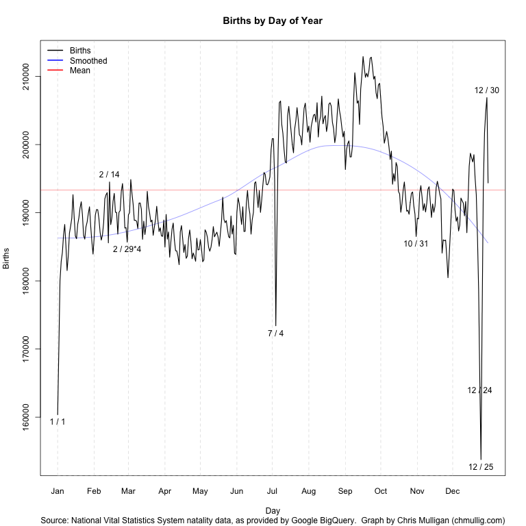
Some basic manipulation (including multiplying 2/29 by 4 per Gelman’s suggestion) and a bit of time to remember all of R’s fancy graphing features yielded this script and this graph:
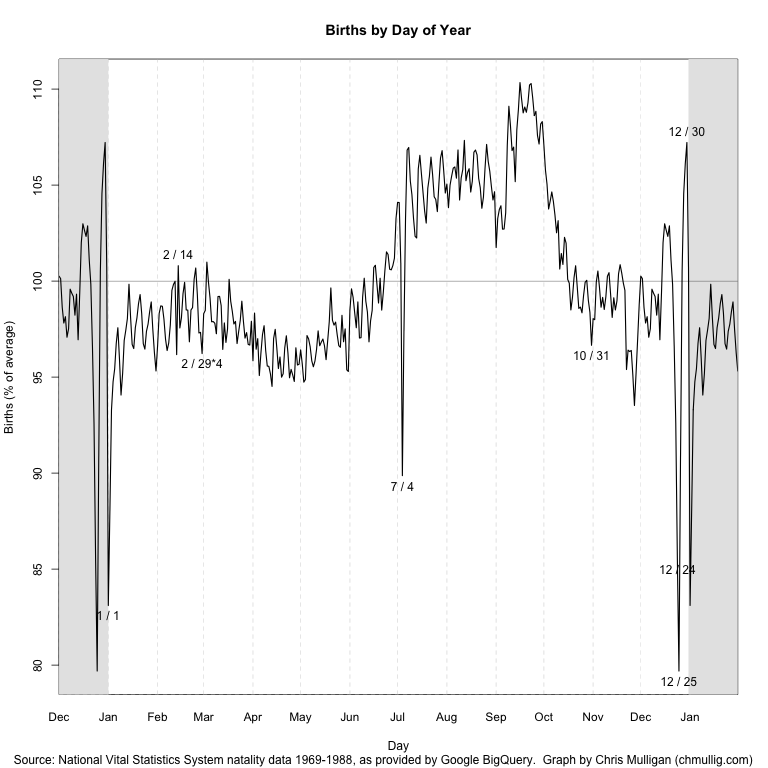
I’ve labeled outliers > 2.3 standard deviations from the loess curve (which unfortunately I should really predict “wrapping” around New Years…), as well as Valentine’s and Halloween. You can see by far the largest peaks and valleys are July 4th, Christmas, and just before/after New Years while Valentine’s and Halloween barely register as blips.
It’s possible there data collection issues causing some of this – perhaps births that occurred on July 4th were recorded over the following few days? The whole thing is surprisingly less uniform than I expected.
Simulating Birthday Problem
I also wanted to simulate the birthday problem using these real values, instead of the basic assumption of 1/365th per day. In particular I DON’T multiply Feb 29th by 4, so it accurately reflects the distribution in a random population. This is data for 1969 to 1988, but I haven’t investigated whether there’s a day of week skew by selecting this specific interval as opposed to others, this is just the maximal range.
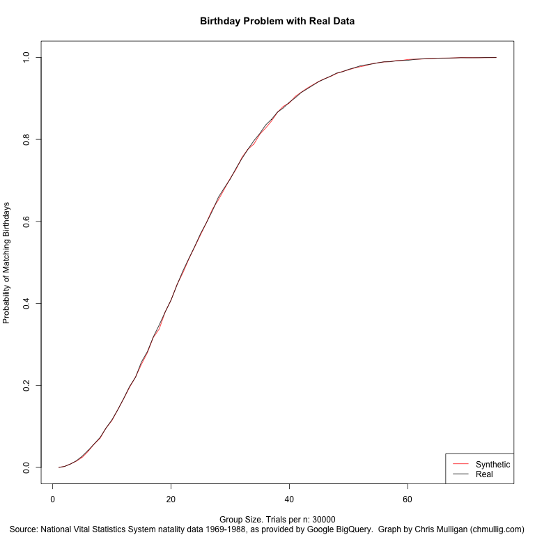
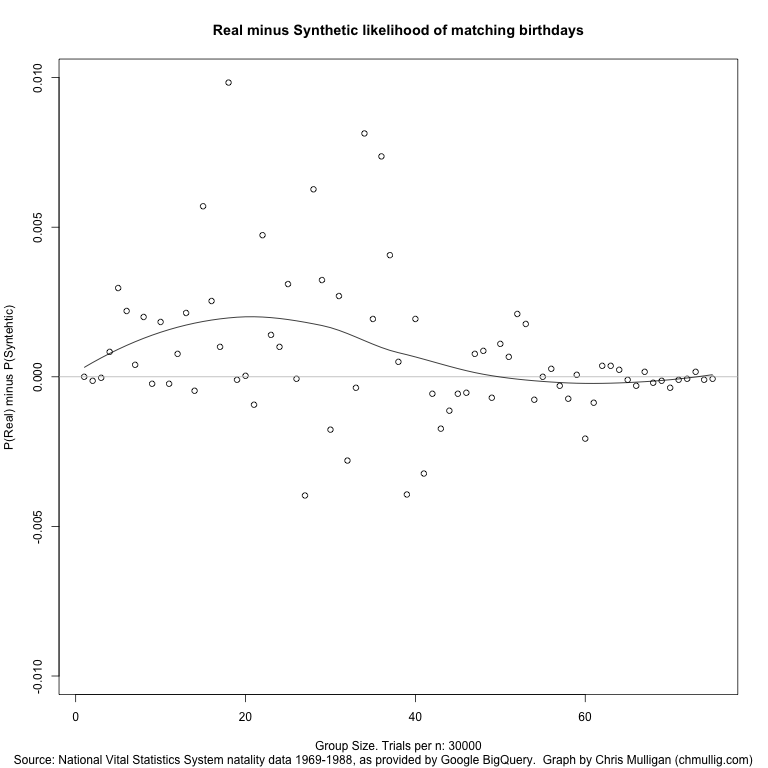
I did a basic simulation of 30,000 trials for each group size from 0 to 75. It works out very close to the synthetic/theoretical, as you can see in this graph (red is theoretical, black is real data). Of note, the real data seems to average about 0.15% more likely than the synthetic for groups of size 10-30 (the actual slope).
I’ve also uploaded a graph of the P(Match using Real) – P(Match using Synthetic).
If you’re curious about the raw results, here’s the most exciting part:
| n | real | synthetic | diff | </tr>
| 10 | 11.59% | 11.41% | 0.18% |
| 11 | 14.08% | 14.10% | -0.02% |
| 12 | 16.84% | 16.77% | 0.08% |
| 13 | 19.77% | 19.56% | 0.21% |
| 14 | 22.01% | 22.06% | -0.05% |
| 15 | 25.74% | 25.17% | 0.57% |
| 16 | 28.24% | 27.99% | 0.25% |
| 17 | 31.81% | 31.71% | 0.10% |
| 18 | 34.75% | 33.76% | 0.98% |
| 19 | 37.89% | 37.90% | -0.01% |
| 20 | 40.82% | 40.82% | 0.00% |
| 21 | 44.48% | 44.57% | -0.09% |
| 22 | 47.92% | 47.45% | 0.47% |
| 23 | 50.94% | 50.80% | 0.14% |
| 24 | 53.89% | 53.79% | 0.10% |
| 25 | 57.07% | 56.76% | 0.31% |
| 26 | 59.74% | 59.75% | -0.01% |
| 27 | 62.61% | 63.00% | -0.40% |
| 28 | 65.88% | 65.26% | 0.63% |
| 29 | 68.18% | 67.85% | 0.32% |
| 30 | 70.32% | 70.49% | -0.18% |
| 31 | 73.00% | 72.73% | 0.27% |
| 32 | 75.37% | 75.65% | -0.28% |
| 33 | 77.59% | 77.63% | -0.04% |
| 34 | 79.67% | 78.86% | 0.81% |
| 35 | 81.44% | 81.24% | 0.19% |
| 36 | 83.53% | 82.79% | 0.74% |
| 37 | 84.92% | 84.52% | 0.41% |
| 38 | 86.67% | 86.62% | 0.05% |
| 39 | 87.70% | 88.09% | -0.39% |
| 40 | 89.07% | 88.88% | 0.19% |
| 41 | 90.16% | 90.48% | -0.32% |
Update
Gelman [commented][12] on the graph and had some constructive feedback. I made a few cosmetic changes in response: rescaled so it’s relative to the mean, removing the trend line, and switching it to 14 months (tacking December onto the beginning, and January onto the end). Updated graph:
[ ][13]
][13]
[12]: http://andrewgelman.com/2012/06/simple-graph-win-the-example-of-birthday-frequencies/ “Simple graph WIN: the example of birthday frequencies
“
[13]: http://chmullig.com/wp-content/uploads/2012/06/birthdays_revised.png


