Posted: November 7th, 2012 | Author: chmullig | Filed under: Nerdery, School | Tags: Columbia, data science, graphing, kaggle, r | 3 Comments »
This semester I’m auditing Rachel Schutt’s Intro to Data Science class. I originally registered for it, but at the end of the add/drop period decided I wasn’t confident in my academic background, and wasn’t sure about the workload that would be required. In retrospect it was a mistake to drop it. However I have been attending class as I can (about half the time).
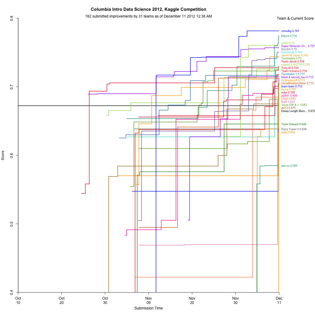
The final project, accounting for most of the grade, is a Kaggle competition. It’s based on an earlier competition, and the goal is to develop a model to grade standardized test essays (approximately middle school level). As an auditor Rachel asked me not to submit, but my cross-validation suggests my model (linear regressions with some neat NLP derived features) is still besting the public leaderboard (Quadratic Weighted Kappa Error Measure of .75), but who knows.
I thought I could easily adjust my MITRE competition leaderboard graph to Kaggle’s CSV, and it turned out to be pretty easy. The biggest issue ended up being that MITRE scored 0 to 100, and this scores 0 to 1. That had some unintended consequences. launchd + python + R should upload this every hour or so (when my laptop is running).
I’m frankly surprised Kaggle hasn’t done something like this before. Maybe if I have a bored evening I’ll try to do it in D3, which should look much nicer.

Update, 12/16: I’ve posted a followup after the end of the semester.
3 Comments »
Posted: April 27th, 2011 | Author: chmullig | Filed under: Uncategorized | Tags: damn lies, data, graphing, lies, presentation, statistics | 3 Comments »
Someone on twitter shared this article about the size of the big 4 ad agencies. Unfortunately it’s horribly, horribly flawed.
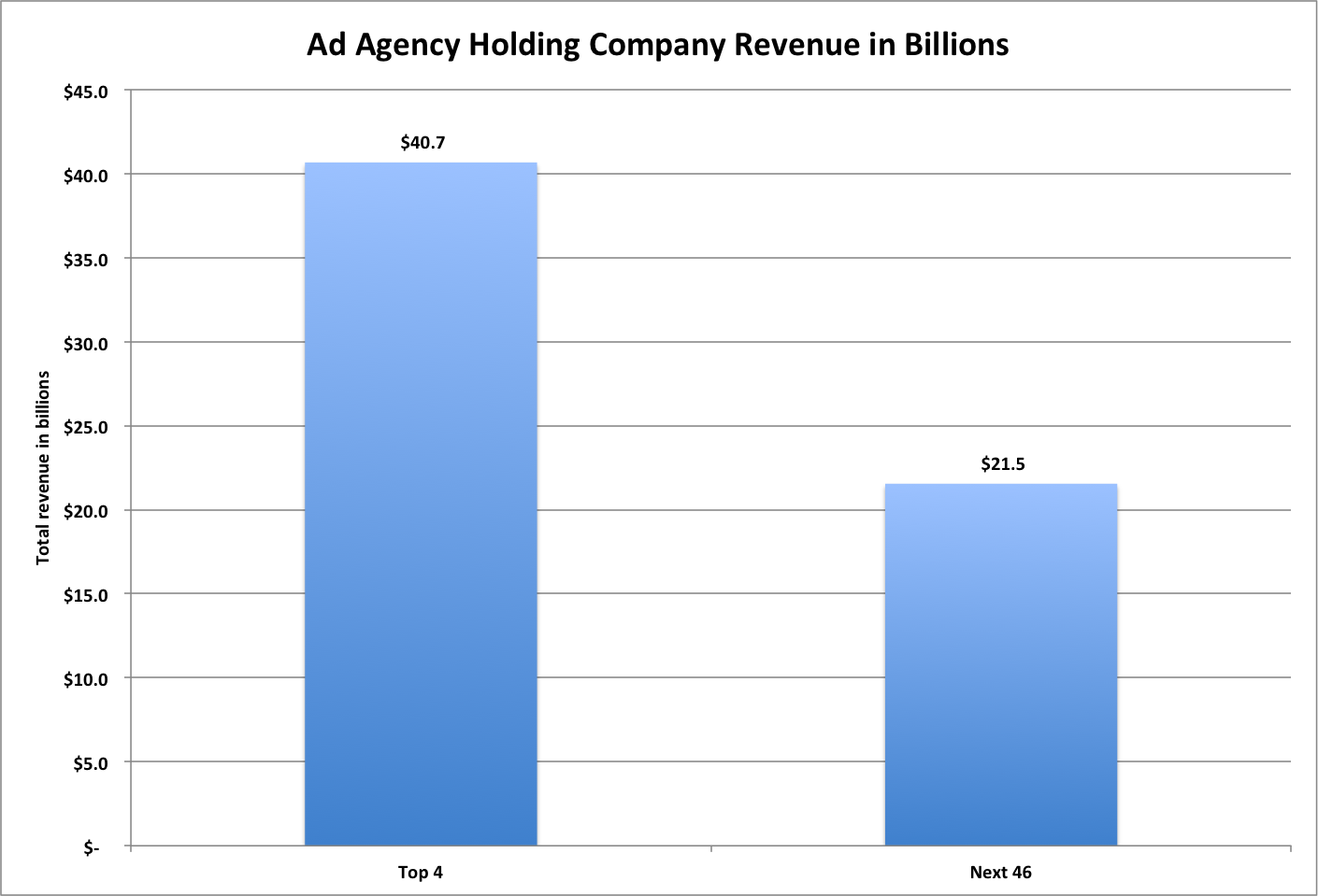
First, the numbers they’re presenting are wrong. I copied the headline numbers that they linked to into Excel (that file, with my graphs, is: here). Their top 4 category is right. The four largest do sum to $40.7 billion. However it appears that their “next 46″ is really numbers 3-50, #3 and #4 are being double counted in both categories. From what I can tell, the real number for the next 46 is $21.5 billion. Perhaps I’m not understanding something about the way these were computed, but that’s my understanding.
Finally, that graph is a travesty to data presentation. The y-axis range (starting at 32 instead of 0) obscures the data, and the cones are stupid beyond words.

Original Ad Age graph. Note the y-axis and stupid cones.
We can easily make that graph more useful by turning it into standard bars with a y-axis that begins at 0. Note that the difference appears much smaller, and more clearly.

My first revision - fixing the y-axis and using normal bars
Finally note that that’s actually a lie, because their summary doesn’t seem to line up with their data. Here’s how it would actually look, as far as I can tell.

This is using the totals I came up with based on their report
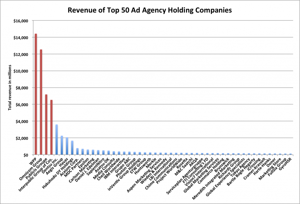
However ultimately I think this is a poor way of expressing the data. Top 4 is, to me, not that significant. I’d rather see how that tail actually plays out. Is it the top 10 that are pretty big, and then 11-50 are microscopic? Is it really just the top 1 that’s huge, and the rest are more even? A graph that shows each company separately would help a lot. So I made each company a bar, ordered them by rank, and highlighted the top 4 in red. To me this graph tells a much richer and more useful story. You can see that WPP and Omnicom are huge. Publicis and Interpublic are pretty large, but only half the first two. Then Dentsu, Aegis, Havas, and Hakuhodo DY are pretty big, around the 2-3 billion mark. Starting with Acxiom is falls off and is pretty consistent. Acxiom is half of Hakuhodo, but every company after is at least 84% of the one before it, with most around 95% of the next highest’s revenue.

Individually graphed agency holding companies. Top 4 highlighted in red. Notice the big changes in the top 9, then pretty consistent numbers.
Again if you’re interested you can check out the Excel file I slapped these numbers/graphs together in by downloading it here.
UPDATE: Matt Carmichael at Ad Age updated his post to something very much like my third. Tufte would be pleased.
3 Comments »
