Posted: December 16th, 2012 | Author: chmullig | Filed under: Nerdery, School | Tags: Columbia, data, data science, kagg, kaggle, python, r, statistics | 1 Comment »
The semester is over, so here’s a little update about the Intro to Data Science class (previous post).
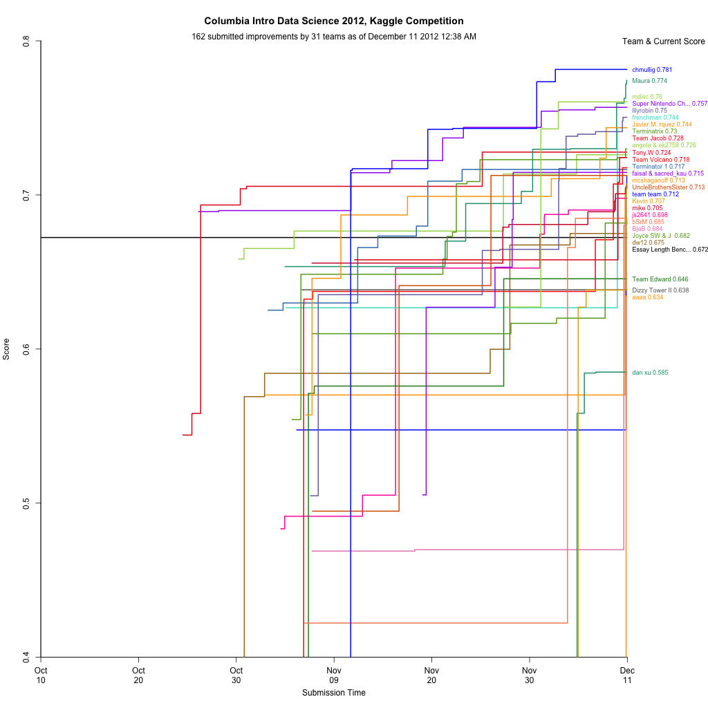
Kaggle Final Project
The final project was a Kaggle competition to predict standardized test essay grades. Although I still had lots of ideas, when I wrapped up a week early I was in first on the public leaderboard, and maintained that to the end. After it was over the private results gave first to Maura, who implemented some awesome ensembling. For commentary take a look at Rachel’s blog post. There’s a bit of discussion in the forum, including my write up of my code.
Visualization
During the competition I maintained a visualization of the leaderboard, which shows everyone’s best scores at that moment. Will Cukierski at Kaggle appreciated it, and apparently the collective impetus of Rachel and I encouraged them to make a competition out of visualizing the leaderboard! See Rachel’s blog post about it for some more info (and a nice write up about my mistakes).
Now back to studying for finals…
1 Comment »
Posted: June 7th, 2012 | Author: chmullig | Filed under: Nerdery, School | Tags: birthday, programming, r, statistics | 17 Comments »
Andrew Gelman has posted twice about certains days being more or less common for births, and lamented the lack of a good, simple visualization showing all 366 days.
Well, I heard his call! My goal was simply a line graph that showed
Finding a decent public dataset proved surprisingly hard – very few people with large datasets seem willing to release full date of birth (at least for recent data). I considered voter files, but I think the data quality issues would be severe, and might present unknown bias. There’s some data from the CDC’s National Vital Statistics System, but it either only contains year and month, or isn’t available in an especially easy to use format. There’s some older data that seemed like the best bet, and which others have used before.
A bit more searching revealed that Google’s BigQuery coincidentally loads the NVSS data as one of their sample datasets. A quick query in their browser tool and export to CSV and I had the data I wanted. NVSS/google seems to include only the day of the month for 1/1/1969 through 12/31/1988. More recent data just includes year and month.
SELECT MONTH, DAY, SUM(record_weight)
FROM [publicdata:samples.natality]
WHERE DAY >= 1 AND DAY <= 31
GROUP BY MONTH, DAY
ORDER BY MONTH, DAY |
Some basic manipulation (including multiplying 2/29 by 4 per Gelman’s suggestion) and a bit of time to remember all of R’s fancy graphing features yielded this script and this graph:
See update at bottom!

I’ve labeled outliers > 2.3 standard deviations from the loess curve (which unfortunately I should really predict “wrapping” around New Years…), as well as Valentine’s and Halloween. You can see by far the largest peaks and valleys are July 4th, Christmas, and just before/after New Years while Valentine’s and Halloween barely register as blips.
It’s possible there data collection issues causing some of this – perhaps births that occurred on July 4th were recorded over the following few days? The whole thing is surprisingly less uniform than I expected.
Simulating Birthday Problem
I also wanted to simulate the birthday problem using these real values, instead of the basic assumption of 1/365th per day. In particular I DON’T multiply Feb 29th by 4, so it accurately reflects the distribution in a random population. This is data for 1969 to 1988, but I haven’t investigated whether there’s a day of week skew by selecting this specific interval as opposed to others, this is just the maximal range.
I did a basic simulation of 30,000 trials for each group size from 0 to 75. It works out very close to the synthetic/theoretical, as you can see in this graph (red is theoretical, black is real data). Of note, the real data seems to average about 0.15% more likely than the synthetic for groups of size 10-30 (the actual slope).

I’ve also uploaded a graph of the P(Match using Real) – P(Match using Synthetic).

If you’re curious about the raw results, here’s the most exciting part:
| n |
real |
synthetic |
diff |
| 10 |
11.59% |
11.41% |
0.18% |
| 11 |
14.08% |
14.10% |
-0.02% |
| 12 |
16.84% |
16.77% |
0.08% |
| 13 |
19.77% |
19.56% |
0.21% |
| 14 |
22.01% |
22.06% |
-0.05% |
| 15 |
25.74% |
25.17% |
0.57% |
| 16 |
28.24% |
27.99% |
0.25% |
| 17 |
31.81% |
31.71% |
0.10% |
| 18 |
34.75% |
33.76% |
0.98% |
| 19 |
37.89% |
37.90% |
-0.01% |
| 20 |
40.82% |
40.82% |
0.00% |
| 21 |
44.48% |
44.57% |
-0.09% |
| 22 |
47.92% |
47.45% |
0.47% |
| 23 |
50.94% |
50.80% |
0.14% |
| 24 |
53.89% |
53.79% |
0.10% |
| 25 |
57.07% |
56.76% |
0.31% |
| 26 |
59.74% |
59.75% |
-0.01% |
| 27 |
62.61% |
63.00% |
-0.40% |
| 28 |
65.88% |
65.26% |
0.63% |
| 29 |
68.18% |
67.85% |
0.32% |
| 30 |
70.32% |
70.49% |
-0.18% |
| 31 |
73.00% |
72.73% |
0.27% |
| 32 |
75.37% |
75.65% |
-0.28% |
| 33 |
77.59% |
77.63% |
-0.04% |
| 34 |
79.67% |
78.86% |
0.81% |
| 35 |
81.44% |
81.24% |
0.19% |
| 36 |
83.53% |
82.79% |
0.74% |
| 37 |
84.92% |
84.52% |
0.41% |
| 38 |
86.67% |
86.62% |
0.05% |
| 39 |
87.70% |
88.09% |
-0.39% |
| 40 |
89.07% |
88.88% |
0.19% |
| 41 |
90.16% |
90.48% |
-0.32% |
Update
Gelman commented on the graph and had some constructive feedback. I made a few cosmetic changes in response: rescaled so it’s relative to the mean, removing the trend line, and switching it to 14 months (tacking December onto the beginning, and January onto the end). Updated graph:

17 Comments »
Posted: April 27th, 2011 | Author: chmullig | Filed under: Uncategorized | Tags: damn lies, data, graphing, lies, presentation, statistics | 3 Comments »
Someone on twitter shared this article about the size of the big 4 ad agencies. Unfortunately it’s horribly, horribly flawed.
First, the numbers they’re presenting are wrong. I copied the headline numbers that they linked to into Excel (that file, with my graphs, is: here). Their top 4 category is right. The four largest do sum to $40.7 billion. However it appears that their “next 46″ is really numbers 3-50, #3 and #4 are being double counted in both categories. From what I can tell, the real number for the next 46 is $21.5 billion. Perhaps I’m not understanding something about the way these were computed, but that’s my understanding.
Finally, that graph is a travesty to data presentation. The y-axis range (starting at 32 instead of 0) obscures the data, and the cones are stupid beyond words.

Original Ad Age graph. Note the y-axis and stupid cones.
We can easily make that graph more useful by turning it into standard bars with a y-axis that begins at 0. Note that the difference appears much smaller, and more clearly.

My first revision - fixing the y-axis and using normal bars
Finally note that that’s actually a lie, because their summary doesn’t seem to line up with their data. Here’s how it would actually look, as far as I can tell.

This is using the totals I came up with based on their report
However ultimately I think this is a poor way of expressing the data. Top 4 is, to me, not that significant. I’d rather see how that tail actually plays out. Is it the top 10 that are pretty big, and then 11-50 are microscopic? Is it really just the top 1 that’s huge, and the rest are more even? A graph that shows each company separately would help a lot. So I made each company a bar, ordered them by rank, and highlighted the top 4 in red. To me this graph tells a much richer and more useful story. You can see that WPP and Omnicom are huge. Publicis and Interpublic are pretty large, but only half the first two. Then Dentsu, Aegis, Havas, and Hakuhodo DY are pretty big, around the 2-3 billion mark. Starting with Acxiom is falls off and is pretty consistent. Acxiom is half of Hakuhodo, but every company after is at least 84% of the one before it, with most around 95% of the next highest’s revenue.

Individually graphed agency holding companies. Top 4 highlighted in red. Notice the big changes in the top 9, then pretty consistent numbers.
Again if you’re interested you can check out the Excel file I slapped these numbers/graphs together in by downloading it here.
UPDATE: Matt Carmichael at Ad Age updated his post to something very much like my third. Tufte would be pleased.
3 Comments »
